It’s here! Now we all have iOS 14 on our devices (albeit quite suddenly) and as a follow-up from my ramblings back in July on the state of the iOS Jailbreak scene, I wanted to look back and see if my wish-list for this release was fulfilled. Also, I want to answer the following question: Do I really need to keep a jailbreak going forward?
Wish-List
In my last post, I listed the areas I hoped Apple would address with iOS 14. Apple have packed a lot into this release, let’s see how many wishes came true.
- Stability – It was hard to imagine a less stable release than iOS 13 in its early days, but so far iOS 14 feels as stable as it can be, so this one gets a tick! ✅
- Picture-in-Picture – We finally have PiP on the iPhone! It’s better implemented than the “ipadify” jailbreak tweak. ✅
- Proper Home Screen Widgets – As we all know, Android’s had widgets for years and with each iteration of iOS we’ve held out hope they’d arrive on iOS. Well, finally they have! And not only that, Apple’s implementation of widgets is magical. The ability to “stack” widgets and choose various sizes of widgets as well shows how much thought they put into the implementation. This is a real game-changer. ✅
- Improved Shortcut Automations – The way interactions work with Shortcuts has been vastly overhauled. They’re properly integrated with the OS now, so the prompts appear as notifications at the top of the screen rather than having to switch to the Shortcuts app for most interactions. This means you can trigger a shortcut from a home screen widget, and interact with it right there. If you assign Back Tap to a Shortcut, it just runs where you are without dropping you out of your app. My only criticism is it would have been nice to have Shortcut app icons run in a similar way, but these still open the Shortcuts app first. Overall, the improvements here are more than I could have hoped for, so… tick! ✅
- Improved Multitasking – Not much has changed here, as multitasking works in the same way as it did in iOS 13. I would have liked to have seen something in the style of jailbreak tweak FloatingDockPlus13, but I have to consider one of the new widgets shows Siri Suggestions for apps, so it can now be quite good at predicting which app you want to switch to on the home screen. Not a biggie, but unfortunately I can’t give this one a tick. ❌
- Better Siri – So, it’s hard to evaluate this one as I’m not a heavy user of Siri. In part, this is due to its unreliability over the years but it’s also because I still feel awkward talking to my phone like its a real person. The visual implementation of Siri however is much improved, showing up as an icon at the bottom of the screen instead of taking over the whole display. Like the Shortcuts improvements, this helps you keep context on what you’re doing when invoking Siri. Unfortunately, I can’t form an opinion on this one without using it for a longer period, so we’ll see how it works out. ❓
My Current Setup
So, how has this new release changed the way I use my iPhone? The answer is the change is pretty dramatic.
Back in iOS 13, I essentially had three home screen pages:
- My most used apps, using custom app icons where supported by the apps themselves.
- Shortcuts, using the awesome icon set built by MacStories.
- The final “homescreen of shame”, where I had a bunch of disorganised folders to keep my lesser used apps in.
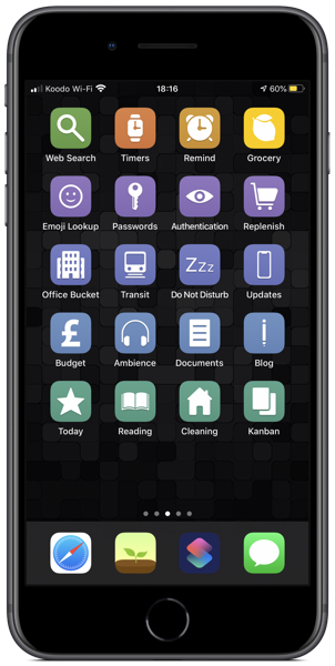
Above is my iOS 13 Shortcuts page.
Under iOS 14, my first page is mainly widget stacks with a focus on Shortcuts.
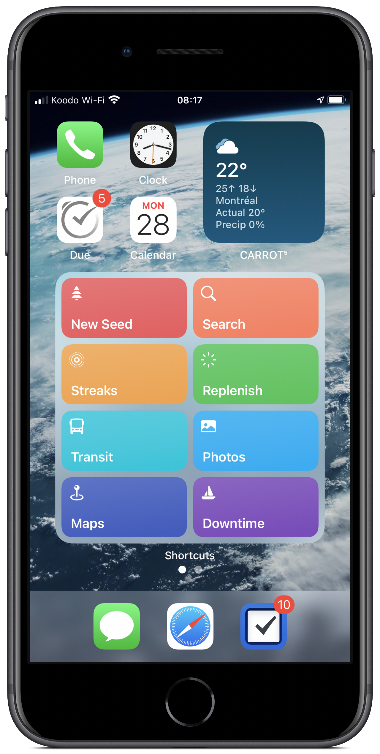
Above is my new first homescreen page.
I’ve kept the Clock and Calendar app icons present, as they’re the only 1×1 icons which are widgetized. In fact, my calendar app of choice is Fantastical, so I have a Shortcuts automation which automatically launches it when I open the main Calendar app.
The stack in the top right contains the following widgets:
- Siri Suggestions (stock widget)
- Fantastical Calendar (Up Next)
- Due
- Things
- Carrot Weather (Forecast)
- Carrot Weather (Daily)
- Widget Wizard (Shows a specific calendar with upcoming birthdays and anniversaries)
- Streaks
- Batteries (stock widget)
- LookUp (Word of the Day)
The main stack contains my Shortcuts, organised into categories by colour – an idea I stole directly from Christopher Lawley. Having the stack colour coded makes it intuitive to flip through and find the Shortcut I need. It’s organised as follows:
- Quick Links (various colours)
- Contacts (green)
- Timers (yellow)
- Documents (turquoise)
- Health (red)
- Media and Entertainment (blue)
- Utilities (grey)
At the end of the stack I have Things showing me my tasks for the day, which is something I frequently refer to as I go about my daily business.
The second page contains apps I regularly use, and mimics my iOS 13 first page in many ways. Right now, it looks a bit dull juxtaposed with the widget excitement on the first page.
There is no third page. Thanks to the new App Library it’s now possible to hide all those apps which used to populate that higgledy-piggledy last page. So, currently I have just the two home screen pages keeping things nice and tidy.
On a similar note, as a long-time customisation junkie – yes, I even created my own hackseveral years back – it’s warming my heart to see how iPhone customisation has taken off with this release. People are doing things with their home screens I never would have imagined.
I’ve no doubt I’ll switch things up over the coming weeks as more apps release widgets, but right now I’m happier than I’ve ever been with my setup.
Will I Jailbreak Again?
For me, the only compelling reason to jailbreak is to get features Apple hasn’t yet provided for. Each time they deliver on functionality I was craving, the need to jailbreak is diminished. This is especially true when you consider the security risks incurred from running a jailbreak, a tradeoff not worth it unless there’s some must-have feature you need. I would have preferred to see revamped multi-tasking à la FloatingDockPlus13, but the new features are so good that I can live without it.
So I won’t be jailbreaking for this release as I can’t think of many features I desire which iOS 14 doesn’t provide for.
I’ve not been this excited about an iOS release since iOS 4 a decade ago. That release in itself updated how people could use and organise their iPhones by introducing tentpole features such as multi-tasking, wallpaper and app folders. This year Apple have raised the bar once again and I can’t wait to see what ideas app developers come up with over the course of the coming months.