
With WWDC approaching, every Apple related blog on the planet is predicting what goodies iOS 13 will bring when it’s announced on Monday. Even more are publishing their wish-lists, and as its been a while since I’ve done one of these myself, let me add to the cacophony of hopes and prayers by providing an iPhone-centric point of view.
Unlike others who use their iPad as their primary machine, such as MacStories’ Frederico Viticci, I’m predominantly an iPhone user. When it was time to upgrade my ageing 5S, I asked myself whether I wanted an iPad and smaller phone (the SE), or if I was going to invest in a top-end iPhone with a large screen and skip the iPad altogether.
In the end, I went with an 8 Plus and haven’t looked back since. In many ways, I use the iPhone as a small iPad. Indeed, the plus sized screen means that - like the iPad - apps can operate in a kind of extended mode when in portrait. Even the home screen acts like an iPad in this way.
So, I wanted to list my top 5 asks from iOS 13 from the perspective of an iPhone user. And heads-up: My main gripe is with the iPhone’s dated home screen.
1. The Volume Popup
You’d be hard-pressed to convince me this isn’t everyone’s number 1! With the exception of some dedicated video apps (such as YouTube), when you press the volume buttons, the resulting pop-up obscures the centre of the screen. Even when listening to music, the same popup will hide whatever you’re working on as you change the volume.
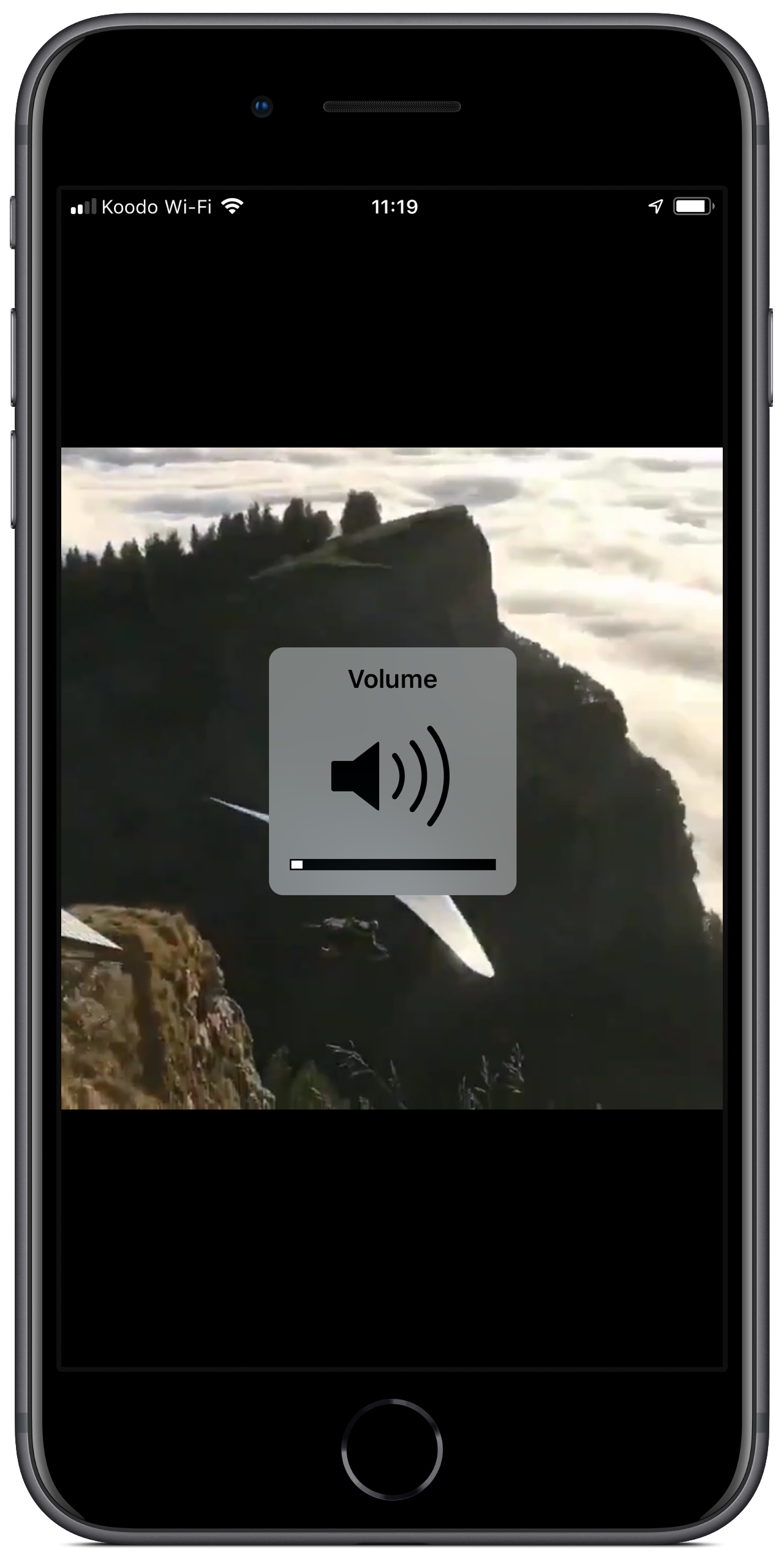
For a company that prides itself in elegant user interface design, I hope Apple nails this one next week.
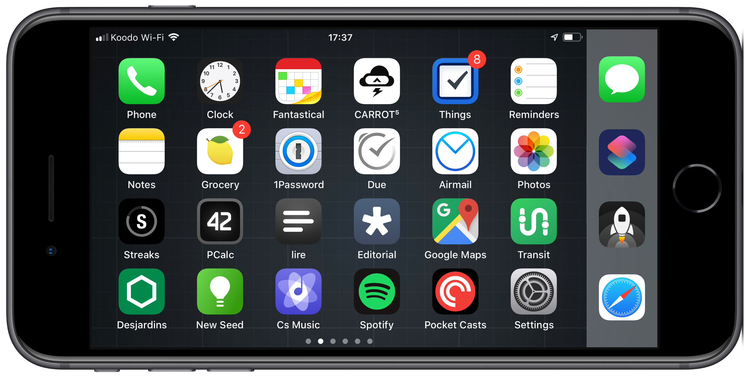
2. Dynamic App Icons & Home Screen Improvements
This isn’t the first time I’ve made a wish to the gods of Apple for this feature.
App icons on the home screen are the ideal place to provide information about an app’s status. And indeed, we have a couple of apps which already do this:
- The Calendar app displays the current date
- The Clock app shows an animated clock
Why not expand this so the weather app shows the current weather, instead of a generic image? Why not open up an API to app developers so they can control what shows on the application icon? Most users land on their home screen when they want to begin a new task on their iPhone, so having app icons act as mini-widgets seems like a sensible and awesome feature to enable.
And speaking of the home screen, it seems about time to let people place icons anywhere they want within the home screen grid. There are a few hacks around which let you do this (here’s my own contribution). But I’d like to see Apple provide a little more freedom in this regard.
Of course, there’s also talk they’ll overhaul the entire home screen experience in iOS 13, so if they do it’ll be interesting to see what they come up with.
3. Reworked Widgets
These days, widgets live in their own section which used to be called “Today” (and still is on the Mac). To get to them, you swipe right on the home screen or right from Notification Center. The widgets are unruly, often switching size as they load or as you interact with them.
Further to my home screen wishes above, it would be nice to see widgets integrated directly into the springboard. I’m not saying Apple should follow the Android approach of letting you stick them anywhere amongst the app icons, as that always seemed a bit crass to me, and leaves home screens looking ugly. What I’d like to see is a way of expanding an app icon into a widget. If we take each app icon to be 1x1, the widget could expand to 2x2 (like a large app icon) or 4x2 (taking up the width of the screen).
Now, before anyone points out to me that using 3D Touch on an app icon will pop out the widget, this is true. However, it doesn’t currently work in the way I’d like it to, and it doesn’t allow you to perpetually have a widget-sized app on your home screen. Also, Apple is about to retire 3D Touch.
4. Shortcuts Improvements
Shortcuts has come along way since Apple gobbled up Workflow to give birth to this magnificent app. Things are definitely more stable than they were a couple of years ago, but there’s a couple of issues which still bug me.
Firstly, the Shortcuts widget tends to die from time to time, and when that happens the only option you have is a reboot. There seem to be various scenarios which can trigger this, but they mostly seem to boil down to the limited amount of memory a widget has available to it.
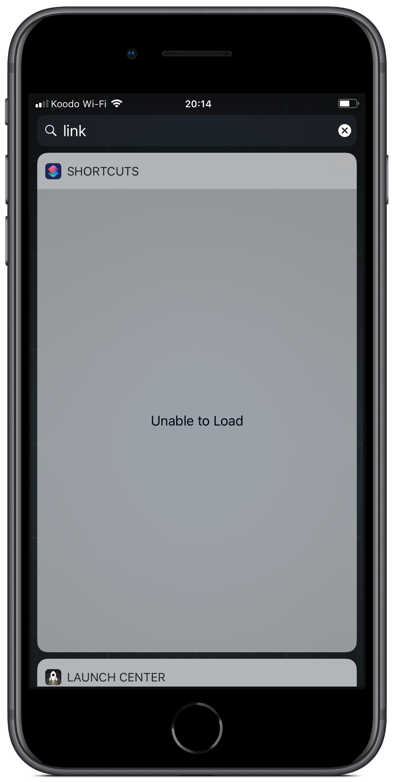
The second change I’d like to see is in how Shortcuts are launched from the home screen. If you add a Shortcut link in this way, it’s done as kind of a hack. You get a web app added using a data URL scheme.
When you launch it, it runs a web app which then launches the Shortcuts app. If you return to the task switcher, you see a holding app in place. It’s an ugly hack, and totally understandable (and ingenious) back before Apple bought Workflow and turned it into Shortcuts. See this video for a demonstration:
With Apple now owning the app and its integrations, these home screen shortcuts should directly launch into the Shortcuts app and run the associated action. The current setup is sloppy and inelegant, and surely Apple can fix it.
5. Top Bar Improvements
If you’ve an app in the background which is location tracking, the top bar turns blue and expands to double size. This creates ugly glitches elsewhere in the OS (just try launching an app and see the app’s splash page be messed up).
Ironically I can’t record a video to demonstrate this, because the recording feature takes over the top bar, and returns it to a sensible single-measure height. However, I did manage to screenshot the effect:
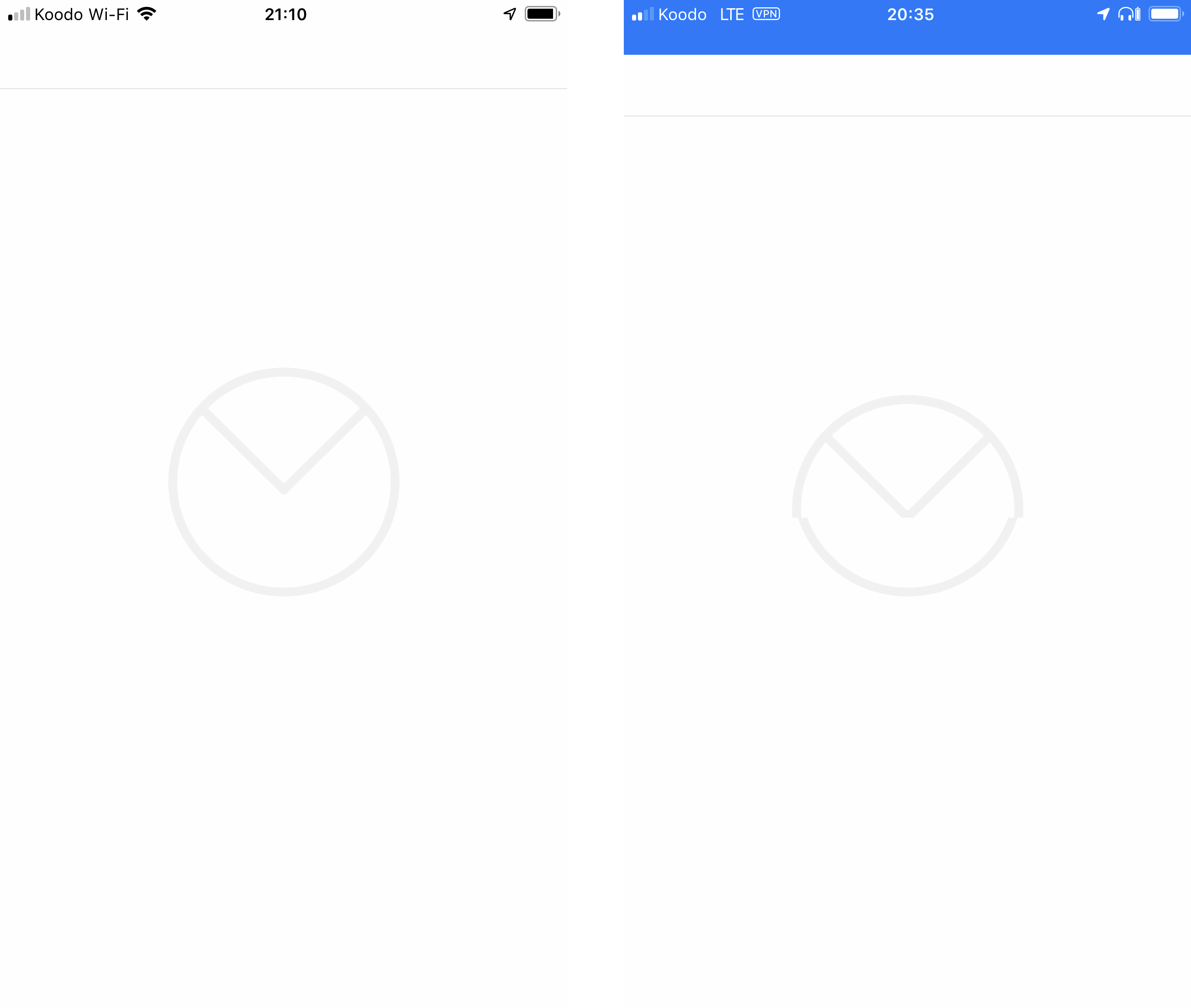
I can’t see a reason for it to be double size, and I hope Apple fix this. It’s unfair to expect developers to implement yet another screen layout for such a limited edge case.
Here’s to an exciting WWDC and some cool announcements from Cupertino!